Selector Products
Understanding the Selector Insight Overlay Report Graphs
Percentile scores
Both scores are presented as percentile scores. A percentile score is a score below which a certain percentage of the observations fall. So, for example, the 20th percentile is the value (or score) below which 20 percent of the observations may be found. In other words, if the candidate scores at the 20th percentile that means she scored higher than 20 percent of the population or, alternatively, 80 percent of the population scored higher than she did.
Example graph
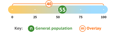
In this example, the candidate’s score ( ) is
at the 55th percentile against the general population. This means his
score is higher than 55% of the population or, in other words, slightly
higher than average.
) is
at the 55th percentile against the general population. This means his
score is higher than 55% of the population or, in other words, slightly
higher than average.
The candidate scores at the 40th percentile
( ) when compared with the population of
candidates who represent to the overlaid industry or demographic. This
means the candidate’s score is higher than 40% of that group or,
conversely, lower than 60% of those candidates.
) when compared with the population of
candidates who represent to the overlaid industry or demographic. This
means the candidate’s score is higher than 40% of that group or,
conversely, lower than 60% of those candidates.
Important note
It is very important to remember the scores are not scores out of a hundred but an indication of how the candidate ranks against the particular population to which he or she is being compared. It is also essential to understand that a higher score is not necessarily a better score and a lower score is not necessarily a worse score—it all depends on the particular trait as to how you interpret your candidate’s scores.